UX Case Study · 2021
NEW ECO
OPTION

A mobile aggregator for scooter rental across Ukraine — collecting scooters from multiple companies so riders can pick the best available option in one easy-to-use app.
- Role
- UI / UX Designer
- Product
- Scooter rental mob app
- Timeline
- 4 weeks
- Tools
- Figma, Maze, Similarweb, Miro, Zoom, Google Workspace
Overview
01 — About the project
Overview
New Eco Option collects scooters of all companies around Ukraine. The app gives users better choice and lets them pick the best scooter available for the ride.
The problem
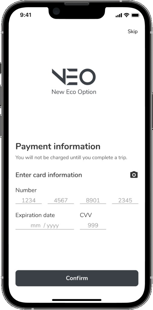
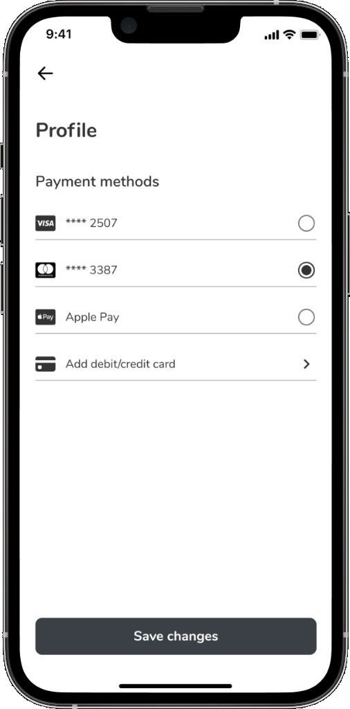
Users need enough scooters in normal condition, at competitive prices, inside one easy-to-use app.
The solution
An aggregator that meets riders where they are — choose a company they trust, compare options, and often pay less because choice is wider.
The process
User-centered design thinking — emphasize real rider pain, define the jobs, ideate with Kano, then prototype and polish the UI.
Project Timeline
Four weeks from research to a 60-screen prototype and UI kit.
- Heuristic Analysis
- Surveys
- Competitors Analysis
- Interviews
- Job Stories
- CJM
- Kano Model
- Informational Architecture
- User Flow
- Prototype
- UI Design
Research
02 — User researchSurveys & Interviews
Talked to riders about choosing apps, finding charged scooters, paying, and ending rides without support tickets.
Job Stories
Turned research into job stories that kept product decisions tied to real situations, not feature wishlists.
When I'm late for a meeting, I want scooters to be available nearby so that I don't waste time getting to them.
When I book a scooter, I want to understand the condition of that scooter, so that there are no problems during the trip.
When I make a stop during a trip, I want to pay less so that I can save on the cost of the trip.
When I open the mobile app for the first time, I want to get the instructions so that I can minimize mistakes in the scooter rental process.
When I book a scooter, I want to take as few actions in the mobile app as possible so that I can speed up and simplify the rental process.
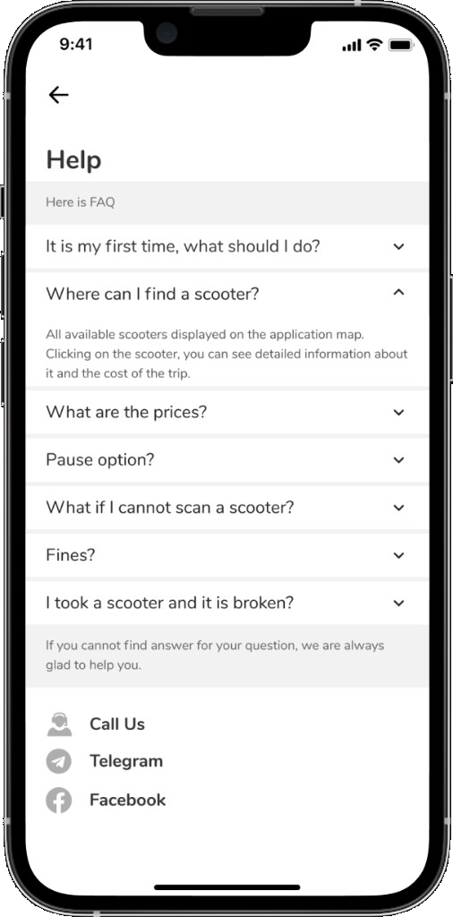
When I encounter a situation where there are problems with a scooter, I want to quickly find support so that I can solve those problems as soon as possible.
Customer Journey Map
Built from surveys and interviews — actions, goals, joys, pain points, and ideas across the full ride loop.
Ask friends about scooter apps
Find the best rental service
Download the app
Sign up, add payment, read terms
Find a scooter · Scan QR
Press “Start ride”
Set the route · Start riding
Follow the rules during the ride
Park in the right place
Photo · Finish ride · Close app
Avoid public transport
Cheap, simple short-distance trip
Get clear instructions before riding
Pay quickly and successfully
Find a charged scooter nearby
Book one in good condition
Take several scooters for a group
Pay less when stopped
Get support if something goes wrong
Take a clear end-of-ride photo
Know where parking is allowed
See others enjoy riding
Cheaper than taxi — especially during lockdown
Payment setup takes little time
Register by phone number only
Understandable onboarding
Rent and go in a couple of taps
Several scooters on one account
Balance and distance shown live
Some apps have faster, wider-wheel scooters
Promo and bonus notifications
Finish: photo, confirm, done
Hard to decide which app to use
Scooter condition is unknown
Underdeveloped riding infrastructure
Phone has little memory for another app
Can't add a bank card in every app
No card-scan or Apple / Google Pay
Hard to find charged scooters in the afternoon
Start still needs a second confirm
Scooter won’t move after a successful scan
No option to disable the speed limit
No phone holder
Battery dies mid-ride despite showing charged
No travel history in the app
Fined for parking with no prior warning
Photo fails — paid more than the ride
- Read reviews before installing
- First trial ride free for 5 minutes
- Short, clear how-to-use & pay instructions
- Card scan or Apple / Google Pay
- Memorable, simpler signup
- Show reviews and last inspection date
- Show estimated ride distance / range
- Add helmets for scooters
- Clearer map with zones
- Pause for 10–15 min at a lower rate
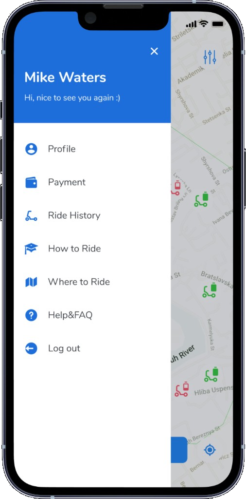
- Simple menu with essentials only
- Alert when parking in a restricted zone
- Call button when FAQ isn’t enough
- Complete ride through operator if photo fails
Kano Model
03 — DefineAn approach which helped identify and prioritize features that should be in the product — to raise the chance of success and improve users' satisfaction.
Informational Architecture
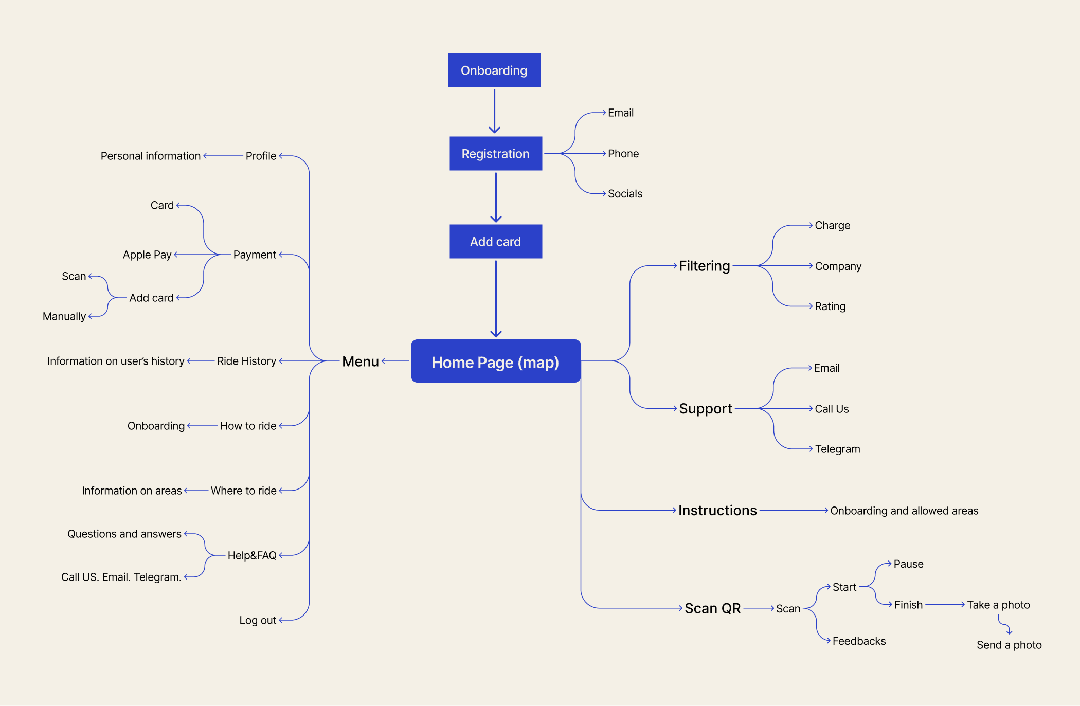
Mind map after features were identified and prioritized — a place to collect thoughts and lock navigation before user flows.
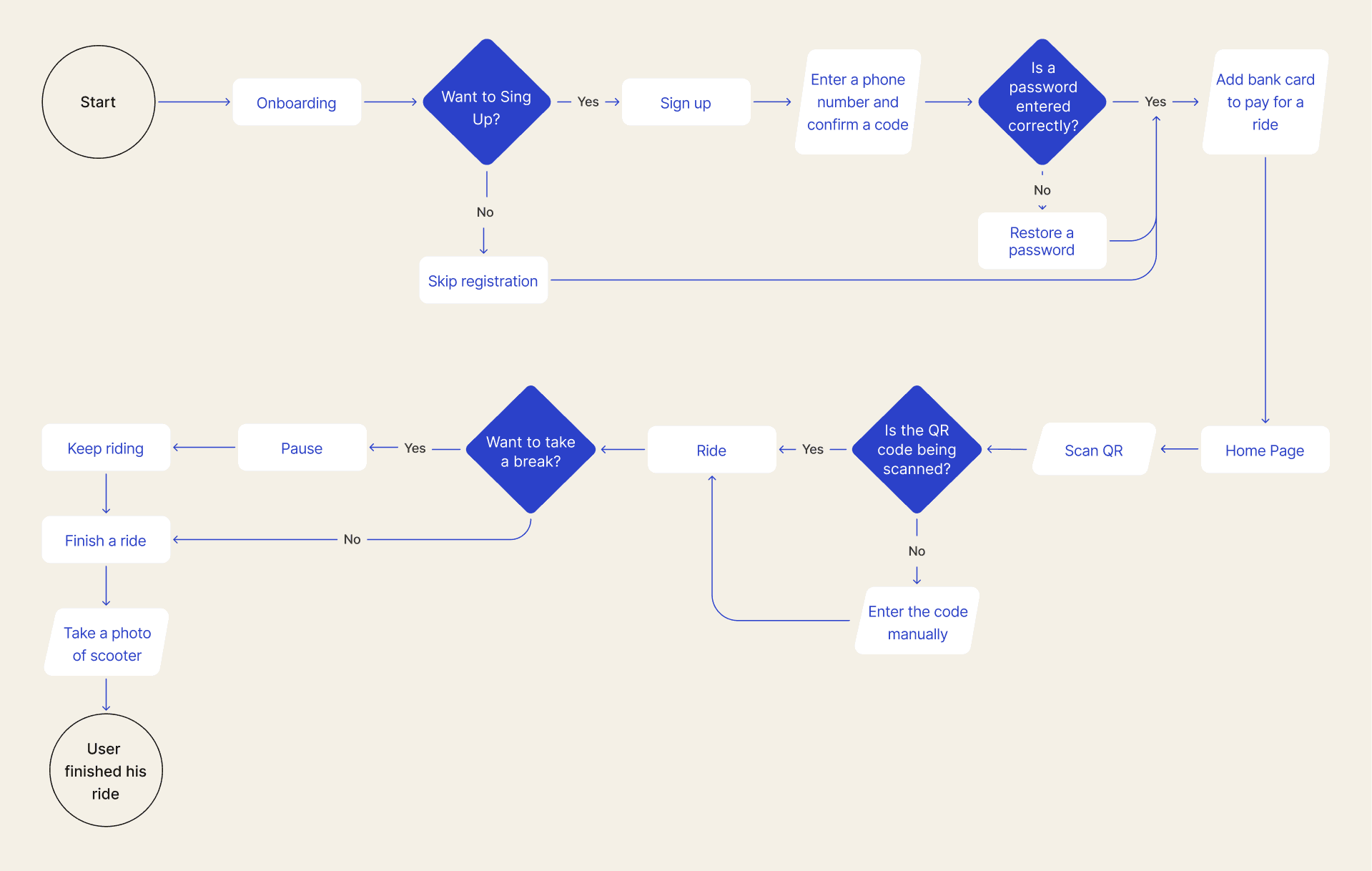
User flow
User flow helped predict the user’s path through the app — and where they can get stuck or frustrated.
Prototyping
04 — Prototype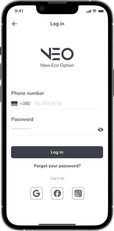
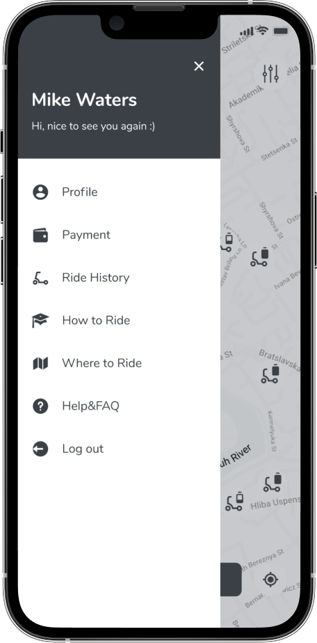
Typography · Colors · Grid
05 — FoundationsTypography
Nunito
Aa Bb Cc Dd Ee Ff Gg Hh Ii Jj Kk Ll Mm Nn Oo Pp Qq Rr Ss Tt Uu Vv Ww Xx Yy Zz
Colors
Grid
Onboarding
06 — UI Design
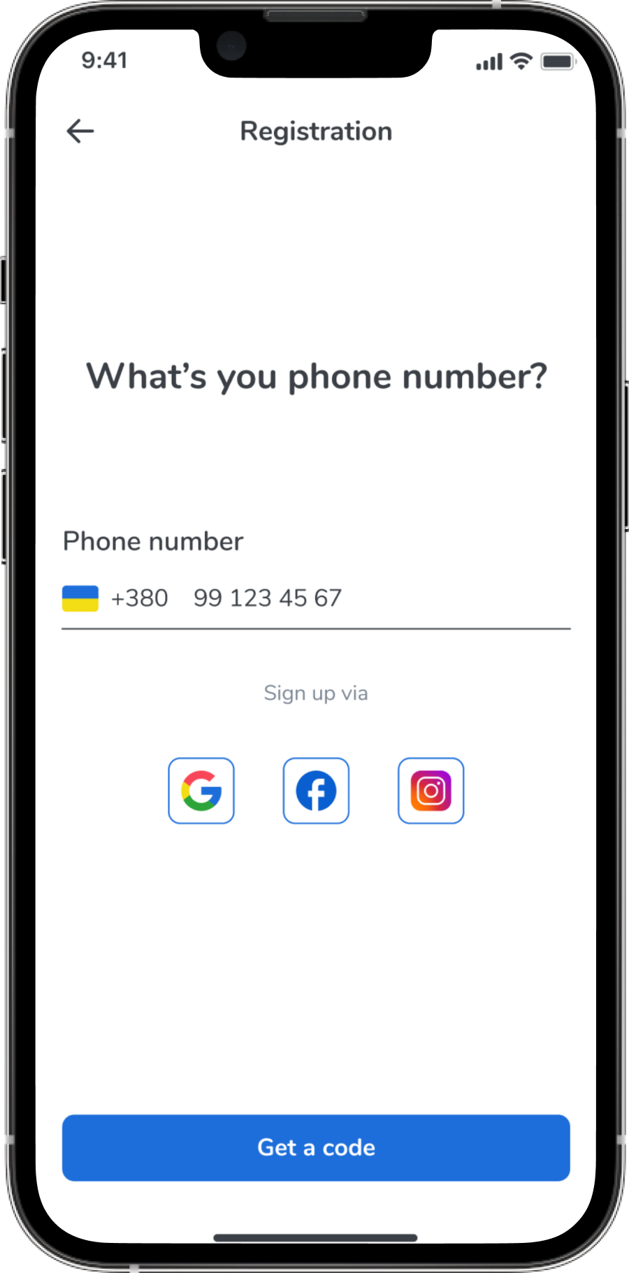
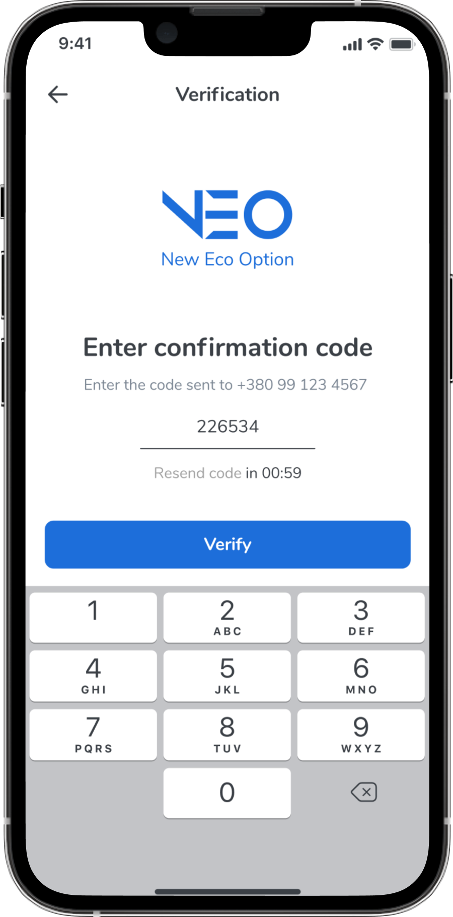
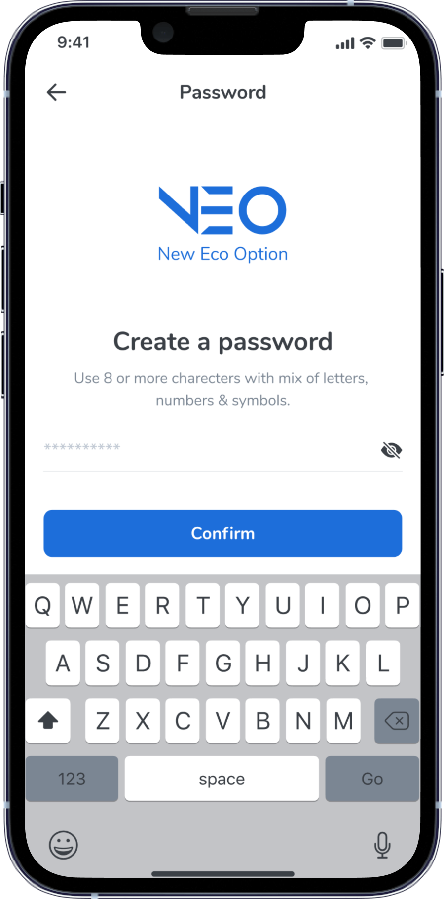
Registration
Scooter’s rent
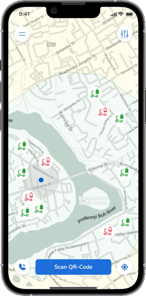
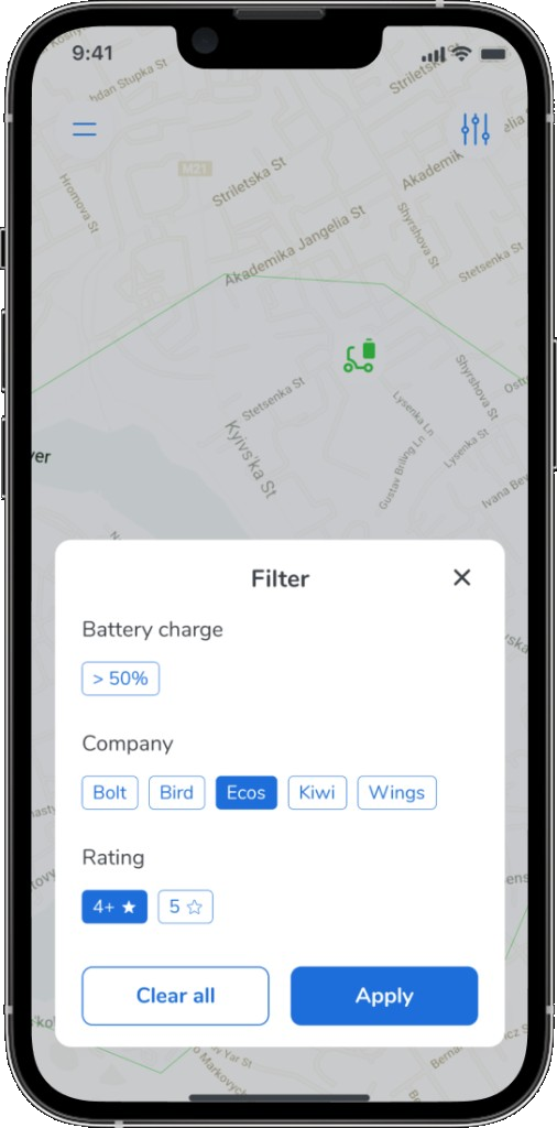
To meet the needs of users and solve their main problems, the process of rent should be as simple and fast as possible. This makes the user satisfied, and gives him a reason to constantly use the application.
Ride details
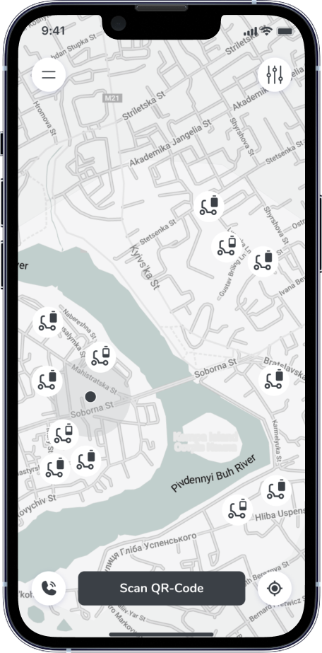
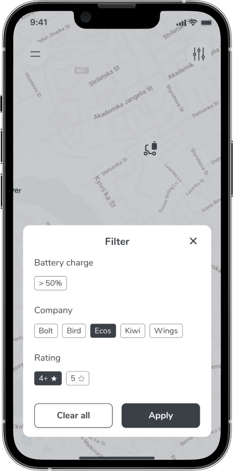
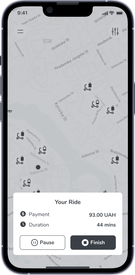
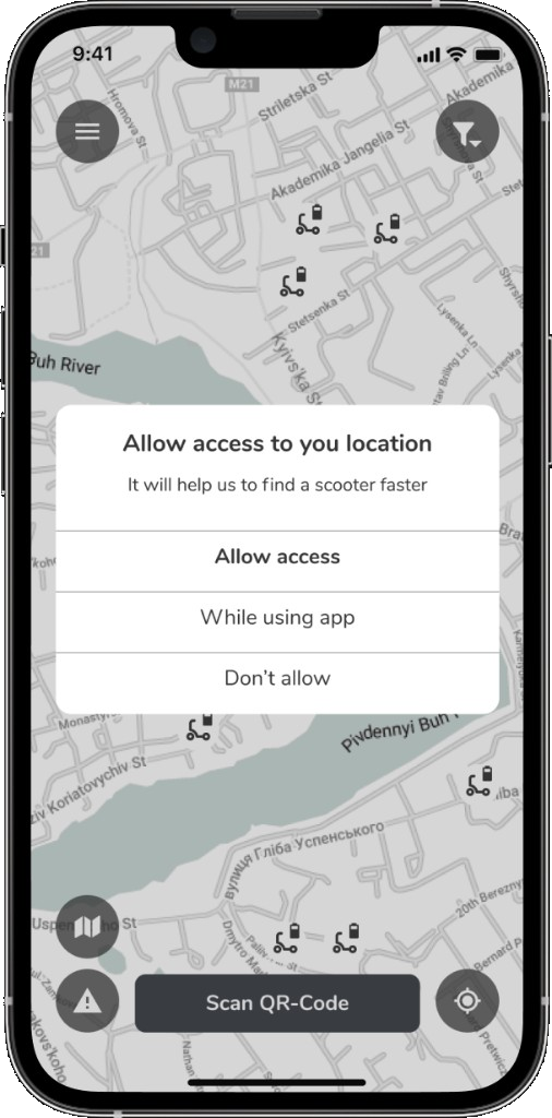
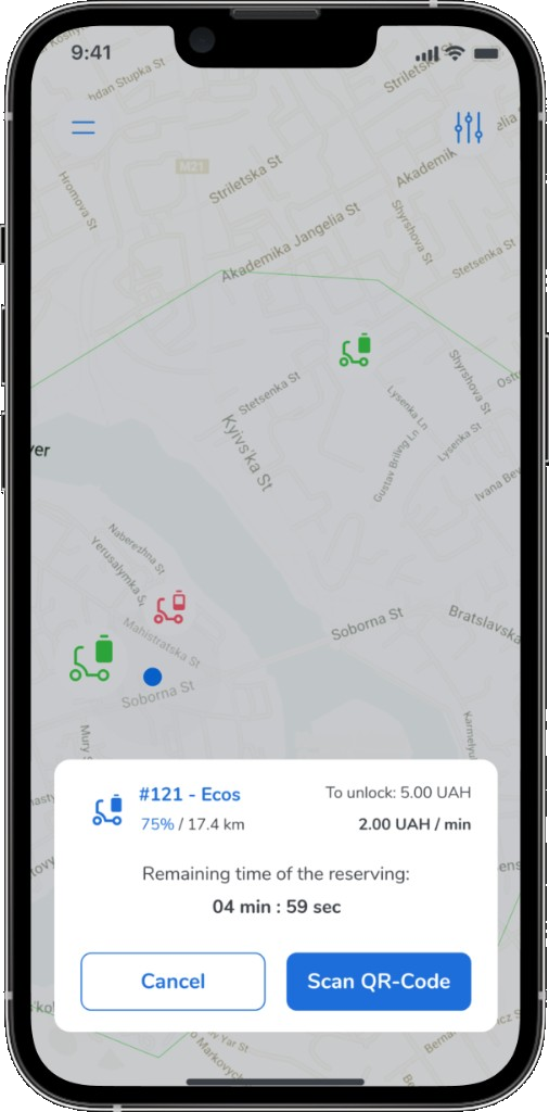
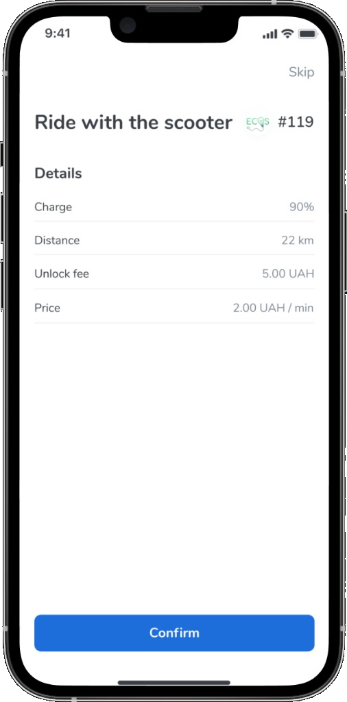
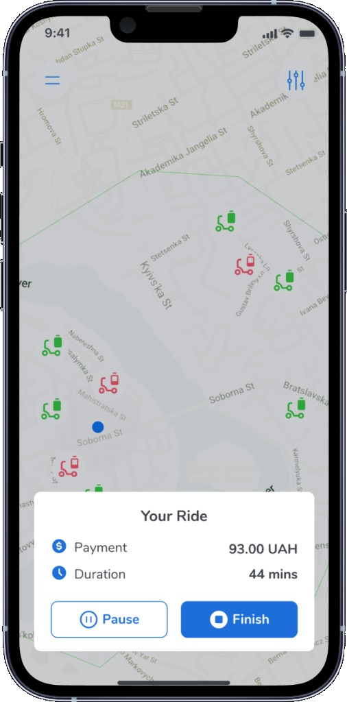
When user sees the scooters on the map, he can easily filter and pick the scooters he needs. The app collected scooters of all companies around Ukraine.
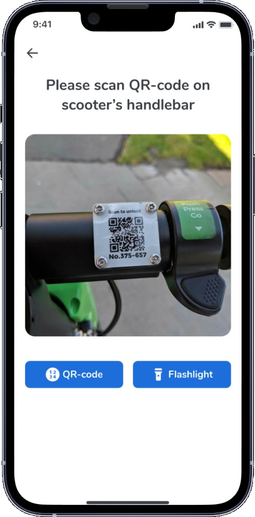
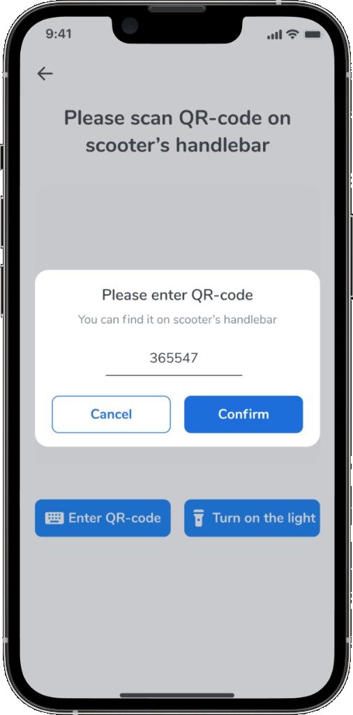
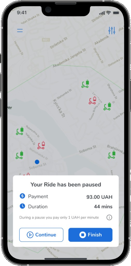
After all user can just scan QR code and ready to go. During the ride he is able to track all details of his ride. Plus it is possible to take a pause and pay less, it is very convenient.
Finish
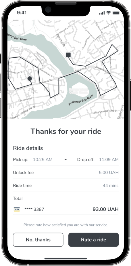
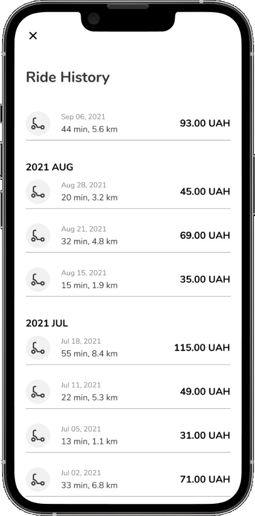
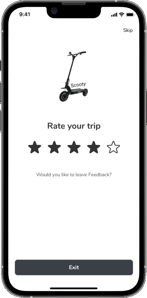
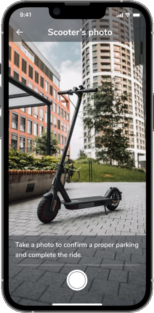
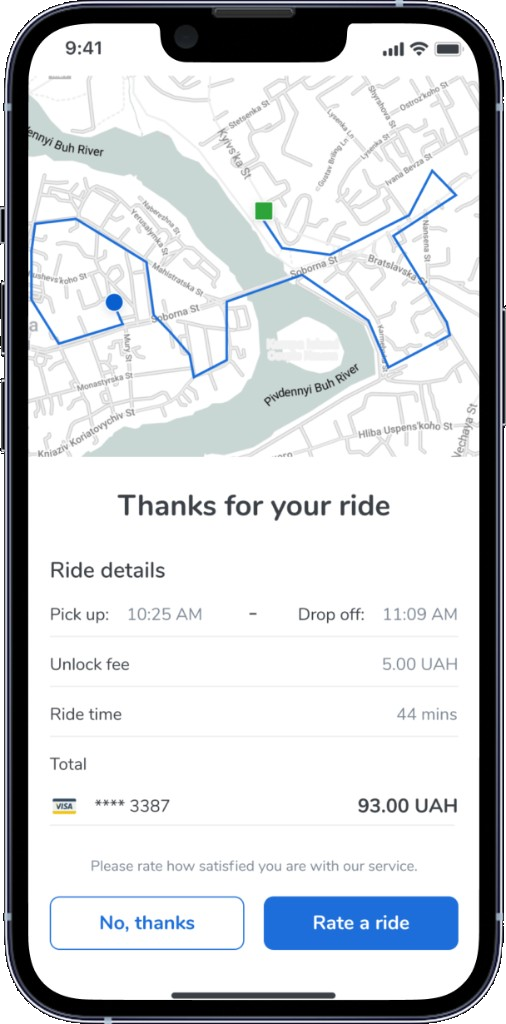
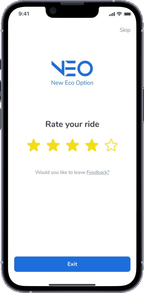
To complete a ride, the user should park a scooter in the proper area and take a photo, and if desired, rate a service/ride.
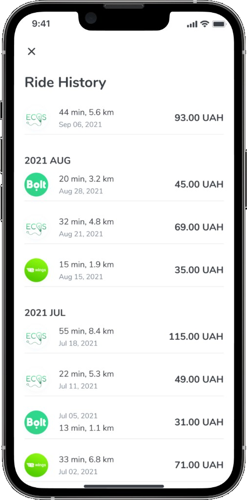
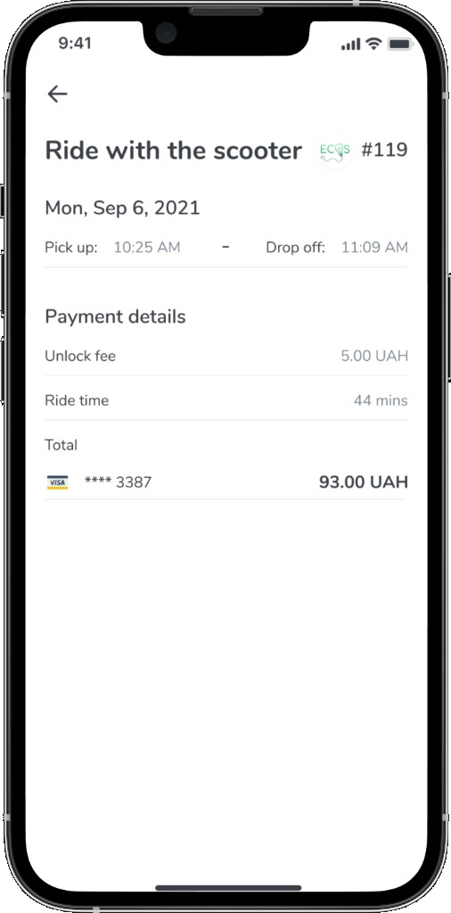
Ride History