Mob app · 2022
Doctors
Online

Online doctor consultations — a refreshed patient and doctor app so people can find a specialist, book a slot, chat, and join a video call from home with as few clicks as possible.
- Role
- UI / UX Designer
- Product
- Telemedicine mob app
- Timeline
- 2 months
- Tools
- Figma, Miro, Zoom, Jira

Introduction

Project Challenge
The case came with three screens, a short description, and several requirements. The app was about three years old and already outdated. The client needed a fresh design and a clear main screen flow for how the product should work.
Project Goal
Help patients get quality online consultations with qualified doctors from home — messaging and calling specialists in a comfortable, familiar environment.
Scope
Kick-off
- Learn requirements’ case
- Customer interviews
- Competitor analysis
UX Research
- User stories
- Customer journey map
- Information architecture
- User flow
Design
- Prototype
- Typography, Colors, UI Design
- Presentation for the customer
Customer interviews
Several interviews with the customer clarified requirements, needs, and project goals. The most important outputs:
User flow should be as simple and comfortable as possible to allow users quickly to set an appointment at a time convenient for them.
It would be good to see the screen flow to understand how it works at least for patients, because it does not differ a lot from the doctor flow in the app.
The outdated version of the app is not relevant anymore. We don’t have design, so we need to develop the new version from scratch.
It is extremely important that users achieve their goal with fewer clicks. Beauty is secondary — priority is convenience and simplicity.
User Stories
These stories frame what users think, feel, and do in the app — seeing Doc24 through their eyes, not only through feature lists.
As a User, I want to sign up in the app as quickly as possible so that it does not take much time to set an appointment.
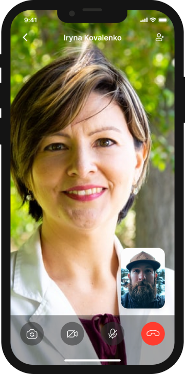
As a User, I want to make video and audio calls in the app so that I can see my doctor while talking.
As a User, I want to see reviews about doctors so that I can book a more qualified doctor based on user reviews.
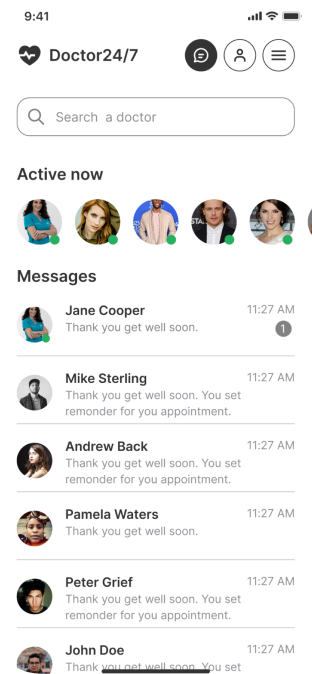
As a User, I want to have chats so that I can easily find previous conversations and ask a doctor a question.
Customer Journey Map
CJM clarifies the path while using the app — happy moments, pain points, and opportunities from first need of consultation through feedback after the call.
- Get information from friends
- Compare different products
- Download the app
- Onboarding
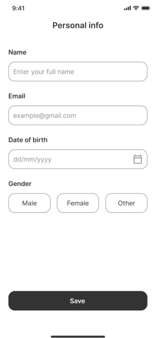
- Enter personal info
- Find a doctor
- Book an available time
- Save it in your schedule and pay
- Open appointments
- Open chats
- Call doctor
- End the call
- Rate the doctor
- Leave feedback
- Save time to get to the hospital
- First step in understanding the personal problem
- Get the instructions of using the app
- Provide personal information for doctors
- Find a qualified doctor among list of doctors
- See available hours and book
- Get a professional consultation
- Get answers on the questions
- Understand the problem
- Rate a doctor and leave feedback to help others in booking
- Get a consultation from the chair at home
- Save some money on the road
- Avoid queue in the hospitals
- Enter only essential and short info
- The process does not take a lot of time
- Cool onboarding
- Doctors are grouped by speciality, it is easy to find
- Comfortable calendar where you can see available time and day
- Availability to read more info about doctor before book consultation
- Audio / Video call
- Can add to call up to 5 specialists
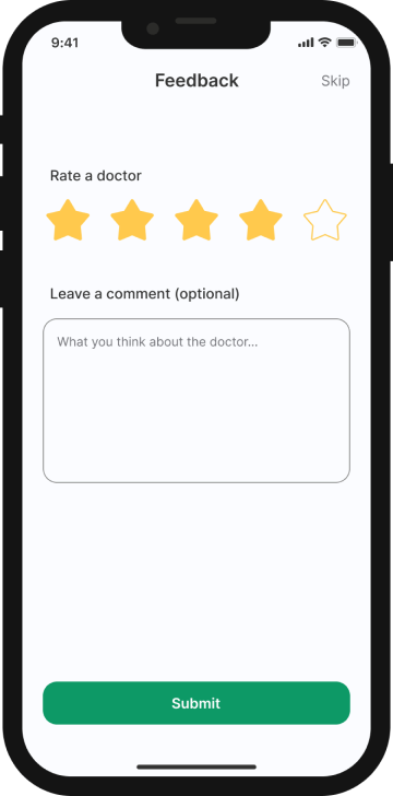
- Rate and feedback on one screen
- Can skip it
- Appointment history
- Many apps, not sure which one is better
- Fear of the doctors’ competence online
- Language barrier
- No wallet in app
- Feature of scanning card is unavailable
- Bonuses
- Take some time to find for the first time, many doctors
- Not understandable how money is written off
- Sometimes video calls are freezing
- No possibility to compare doctors
- Give opportunity to users to get first consultation for free
- Before start using any app users have to investigate more how it works
- Ability to have a wallet to top up it
- Apple / Google Pay
- Easy and quick way to sign up
- See the reviews of doctors as well as ratings
- Possibility to read as much info about doctor as possible
- Quick booking process
- Improve quality of videocalls
- After leaving feedback send user to history
- Support users in case of some troubles
Information Architecture
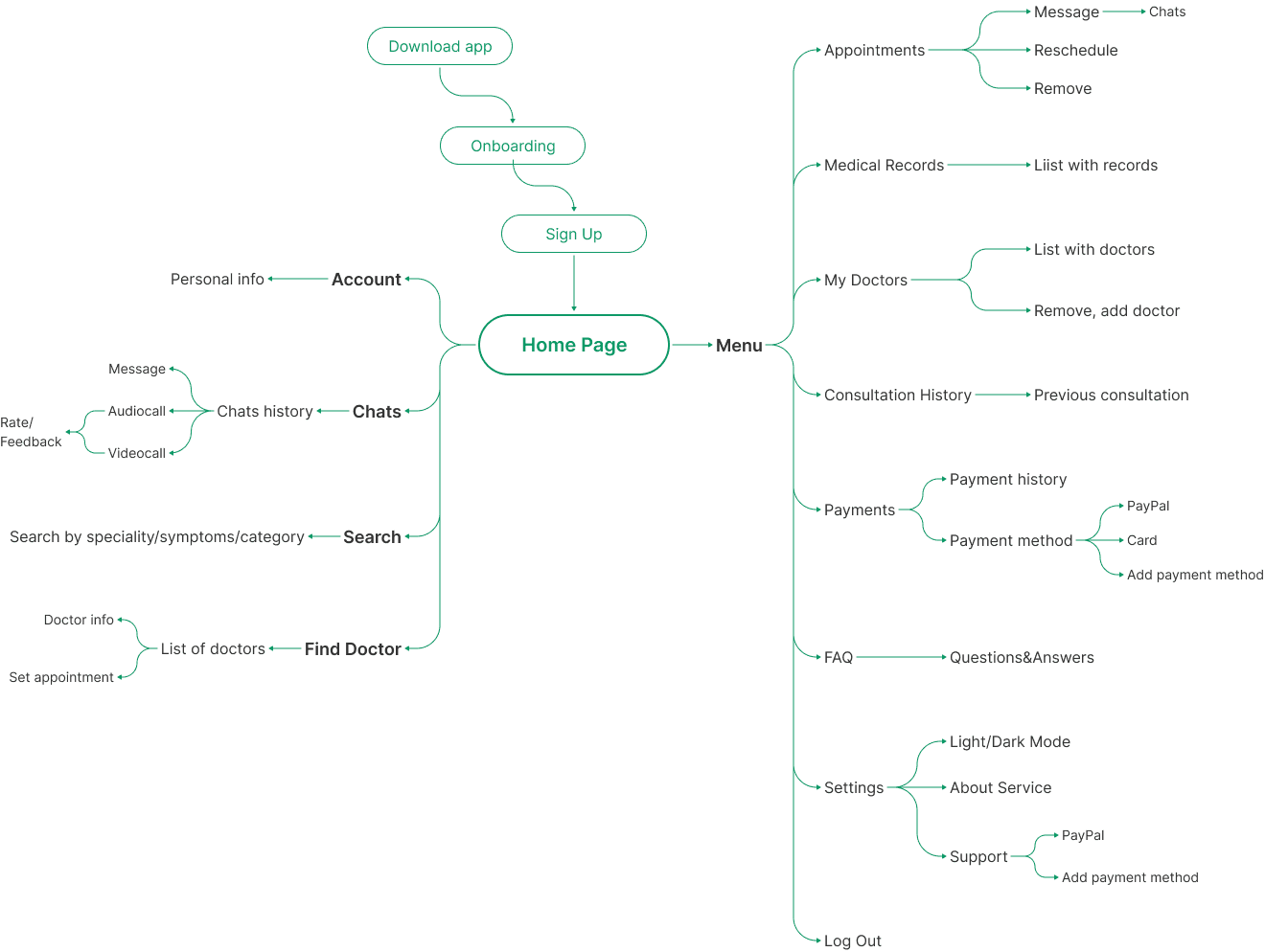
Mind map from competitor and heuristic work — structuring Home, Sign up, Find Doctor, Appointments, and Medical Records before prototyping.
User Flow
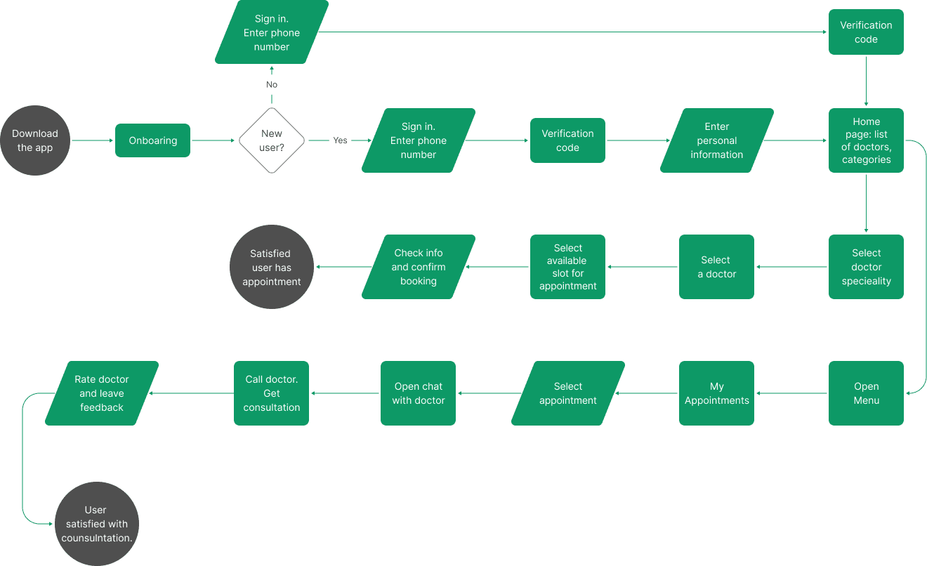
Keep the path short: specialty → doctor → slot → consult → rate. Same logic for patients; doctors share most of the interface with a different home and menu.
Prototyping
Color Palette & Typography
inter
regular & semi bold
Aa Bb Cc Dd Ee Ff Gg Hh Ii Jj Kk Ll Mm Nn Oo Pp Qq Rr Ss Tt Uu Vv Ww Xx Yy Zz
1234567890!@#$%^&*()
Design
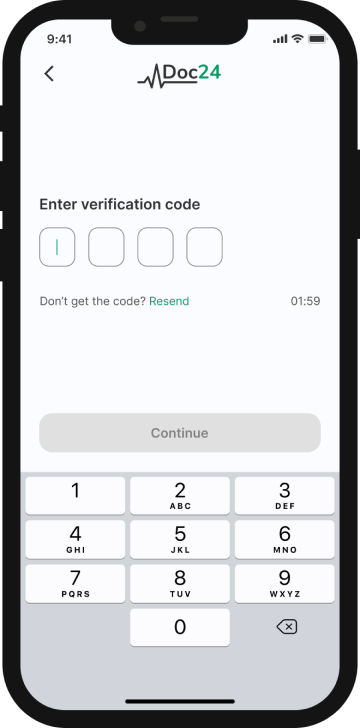
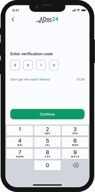
Onboarding & Sign up
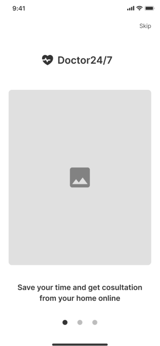
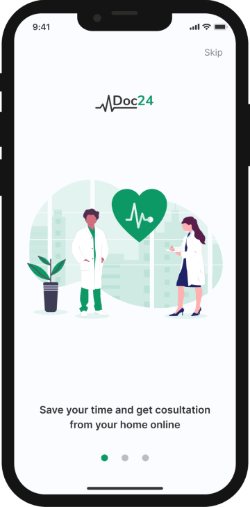
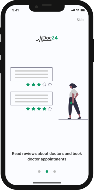
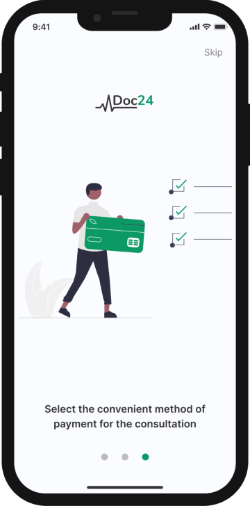
Users can quickly understand how to use the application by going over onboarding.
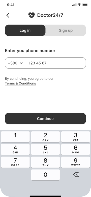
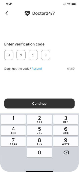
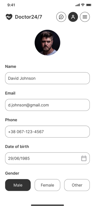
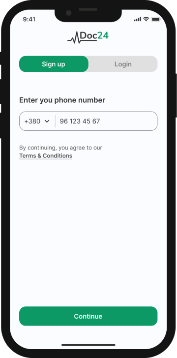
Quick registration saves time, letting users start interacting with the app right after confirming the phone number.

Set an appointment
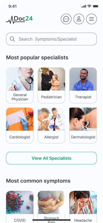
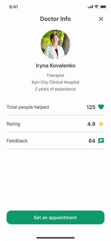
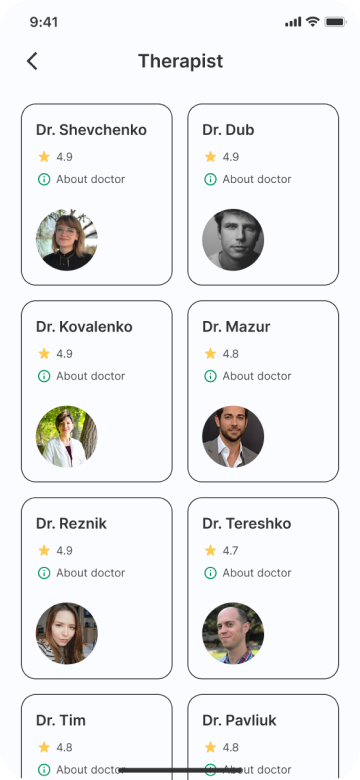
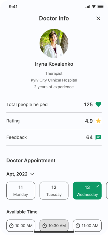
Just a couple of clicks get the user closer to a consultation with a doctor.
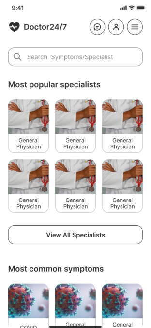
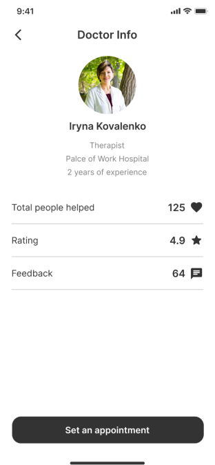
On the home page patients find the speciality or their symptoms, pick the right doctor, read other patients’ reviews and set an appointment.
Consultation
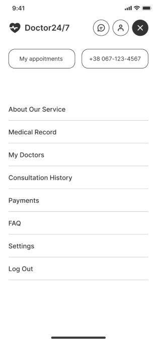
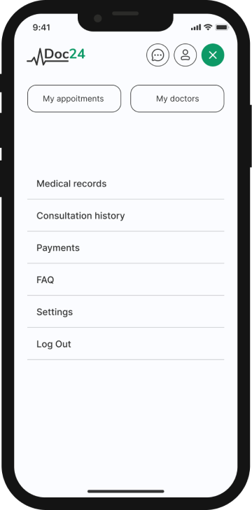
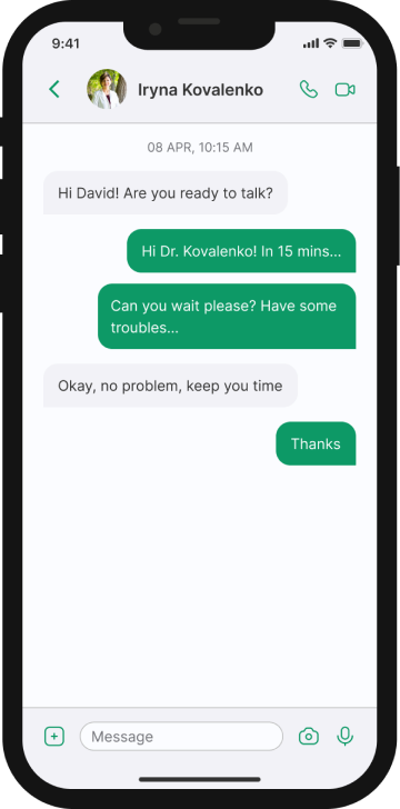
Opening the menu lets users jump straight to appointments and doctors — the main calls to action, since patients reach for them most often.
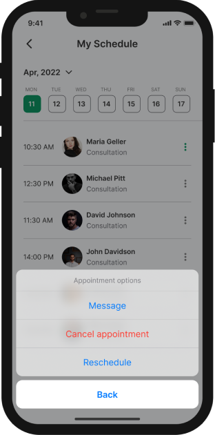
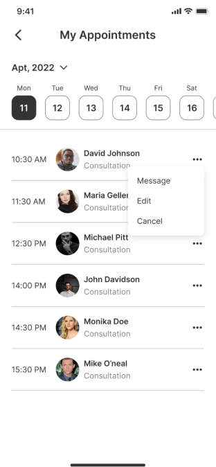
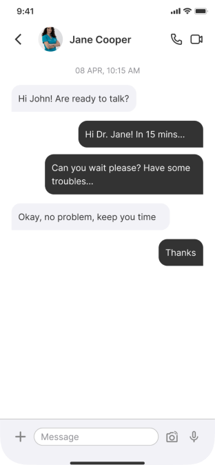
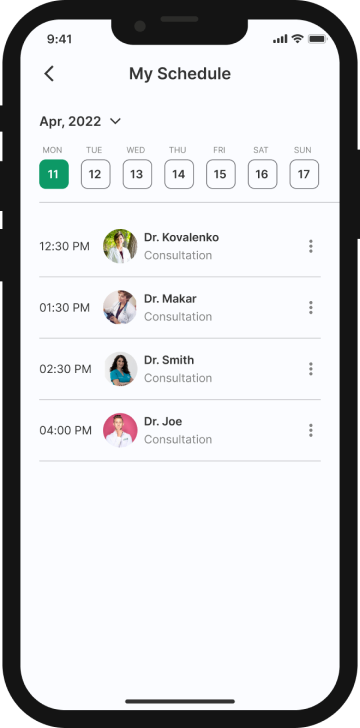
“My appointments” takes users to their schedule, where they manage bookings, start a conversation with the doctor, join the call, and leave feedback afterwards.
Doctors
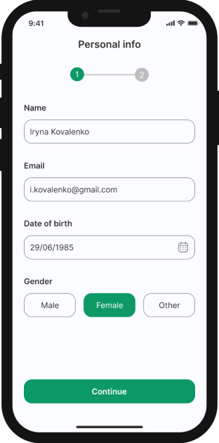
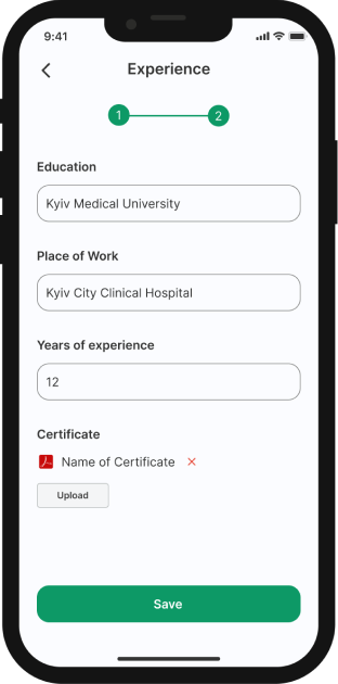
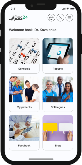
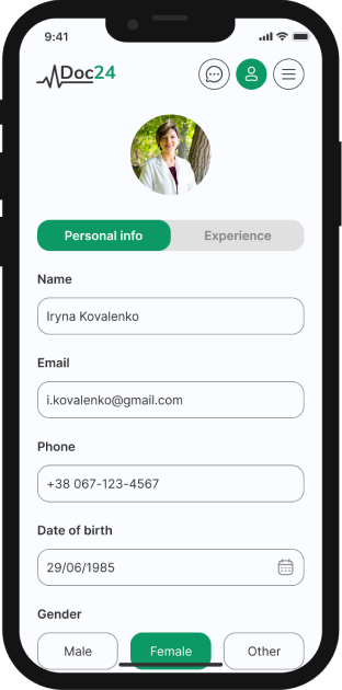
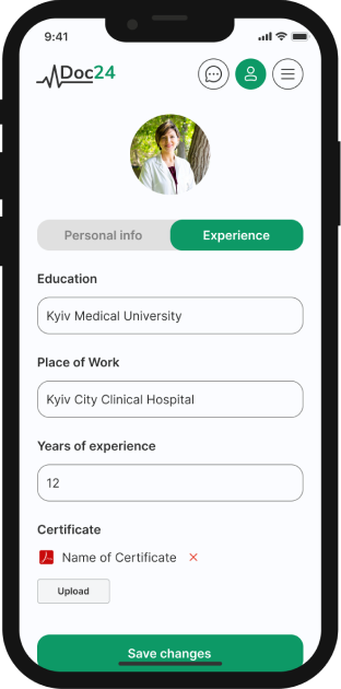
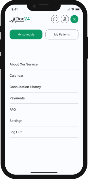
The doctor’s side follows a slightly different flow.
Sign-up takes two steps, the home screen surfaces its own set of categories, and the menu differs from the patient’s — yet the interface stays familiar throughout.